Category Comparison
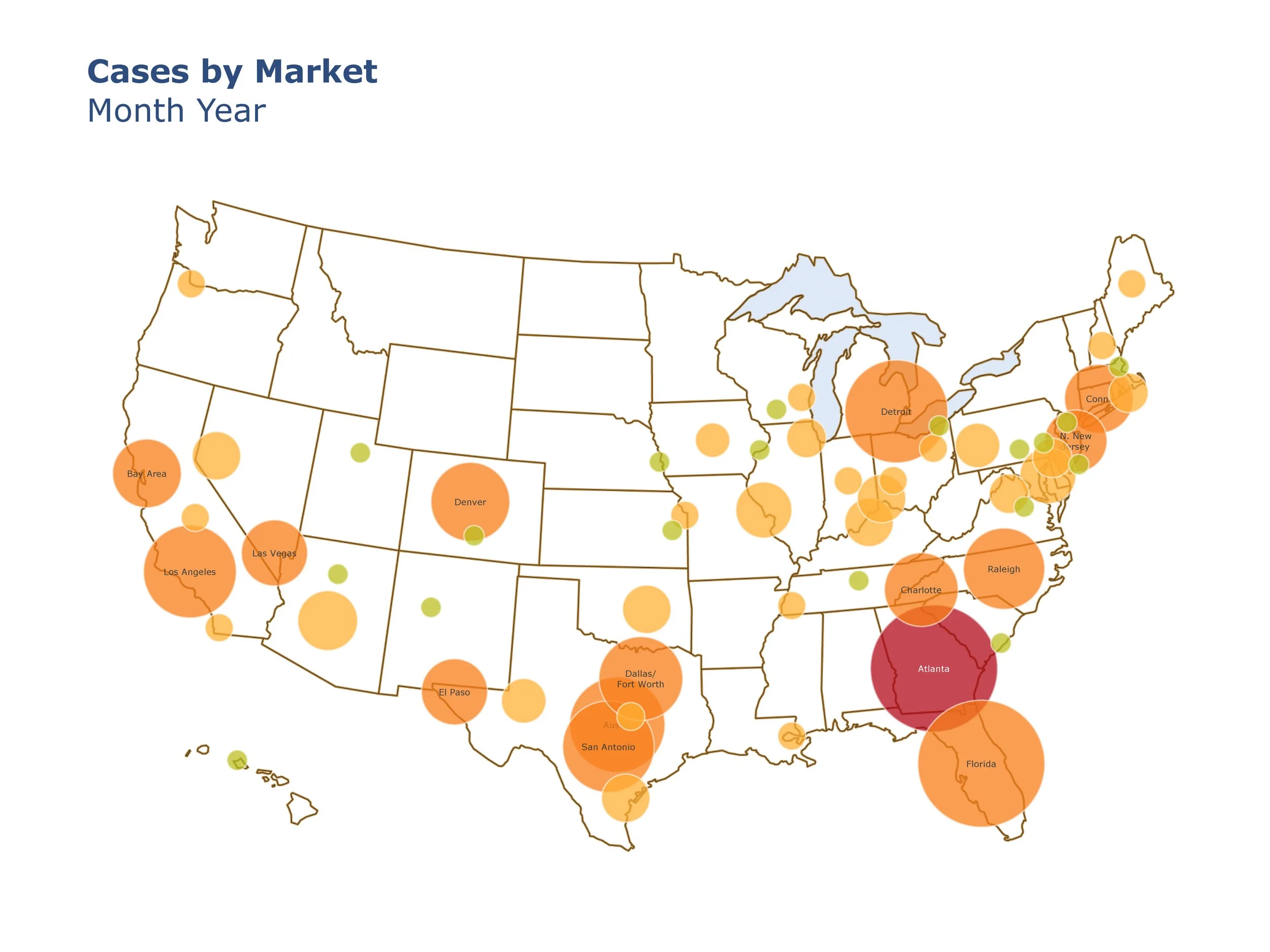
Cases by Market
Executive leadership requested a quick-reference visualization to show where a specific type of business case was occurring across the U.S.
To ground the data geographically, I used a U.S. map as the base and manually created a proportional bubble chart to represent volume by location (larger circles indicated higher case counts). I added color coding to reflect concentration levels and labeled key markets to support quick interpretation. A corresponding legend was also developed but is not shown here to protect sensitive information.